
Form one (curved) line for a free lunch
In writing these blog posts I have tried to start out with some basic concepts — risk, return, present value, compounding — and then build on them so that the complete picture of how the financial markets work begins to emerge. In this post we’ll build on the post about risk and return and show that by mixing different investments into a portfolio we can maximise the return we expect to receive for any given level of risk. We’ll also see that by making a blended portfolio we’re going to get a “free lunch”, or a small reward at no additional cost to us. This is the magic of blending assets in a portfolio. We’ll use an example of two possible investments to make the explanation easier.
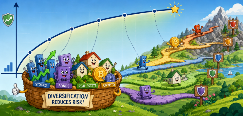
My grandmother used to say “Don’t put all your eggs in one basket”. It’s a catchy idiom that reminds us not to concentrate all our efforts or resources in one area. If you drop the basket then all your eggs may break. My grandmother gave this advice for free. Nowdays fund managers and advisers also offer this advice, but they call it “diversification” and charge you a fee for it. Diversification is spreading your investments around so that if one asset class has a downward price movement you don’t lose all your money because other parts of your portfolio move down less or even move up. It means not putting 100% of your money in one investment.
When you mix your investments your expected return becomes a blend of the returns of the two investments. So if you put half your money in an investment that returned 10% and the other half in an investment that returned 5% you’ll end up with a total return of 7.5%: half of 10% plus half of 5% equals 7.5%. This return relationship holds for whichever way you blend your investments, even when there’s lots of them. You get the weighted average return of all your investments. That part is easy to understand. Let’s now look at what happens when your investments’ values move by different amounts. This is where the magic really starts to happen.
The extent to which the values of two investments move together is called “correlation”. It’s a number between -1 and +1. If two investments have a correlation of -1 then if one goes down 5% the other goes up 5% and your portfolio loses no value at all. If their correlation is +1 then they both move the same way. Anywhere in between and their price movements will be different but to lesser or greater extent below and above zero. You don’t need to calculate correlation yourself, so don’t worry too much about how the calculation is done. The important part is that to get the benefits of diversification we want to buy two assets which have the lowest correlation possible.
To reduce risk it is necessary to avoid a portfolio whose securities are all highly correlated with each other.
Professor Harry Markowitz
So if you invest in two assets whose price movements are less than perfectly correlated — a typical example is equities and bonds — you get an additional benefit in risk reduction. Instead of getting a weighted average of the risk of the two investments (as we did when calculating the returns a few paragraphs above) we get the “free lunch” I mentioned. Due to a quirk in the mathematics of portfolio risk there’s an interaction effect which is best explained in the charts below.

The chart on the left shows two investments whose price movements are perfectly correlated: when one moves up or down, the other moves up or down by the same amount. Our return, and risk, depend only on the proportion of our money we invest in each of them. At 100% bonds we have low risk of around 5% and a low expected return of around 2.5%. At 100% equities we get higher return potential but higher risk. That’s to be expected, as we explained in an earlier post. At 50/50 our risk is higher than bonds alone and lower than equities alone and our expected return is around 5%.

The chart on the right is where the surprising results appear. When the price movement of our two asserts is less than perfectly correlated — in this example the correlation is -0.5 — we get our “free lunch”. Looking at the chart the blue line becomes curved; the yellow line is the chart on the left superimposed for comparison. A curved blue line shows that, as we blend our uncorrelated investments, we can achieve a higher return for every level of risk. Better still, for some blends of investment (where we have a large allocation to bonds) we can achieve both a higher return and a lower level of risk. That region is the bullet-shaped part of the curve on the left. The red dot at the point of the curve is the blend of these two investments with the lowest risk. For a risk-averse investor this 86% bonds/14% equities portfolio is the best option for them. Of course investors are free to choose any blend of assets that suits their preferences.
This is a surprising outcome as it appears to run against the usual relationship of risk and return. It’s such a special result that the person who discovered it in 1952, Professor Harry Markowitz (pictured), received the Nobel Memorial Prize in Economics for it, but he had to wait nearly 40 years to get it.
The reason why we are able to achieve this result is due to imperfect correlation. There’s some rather complex maths that explains it but the maths is less important than using it to your advantage. And that’s how diversification works for you, and why it’s an important part of a well-balanced investment portfolio.
So get your eggs and put them in a range of baskets, form a (curved) line and claim your free lunch today. Your portfolio will thank you for it.
